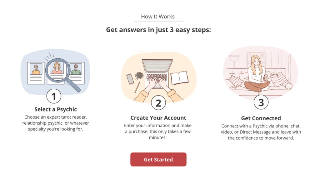
Successful data resulted in implementation of an illustrated 3-Step How It Works section
Project Overview
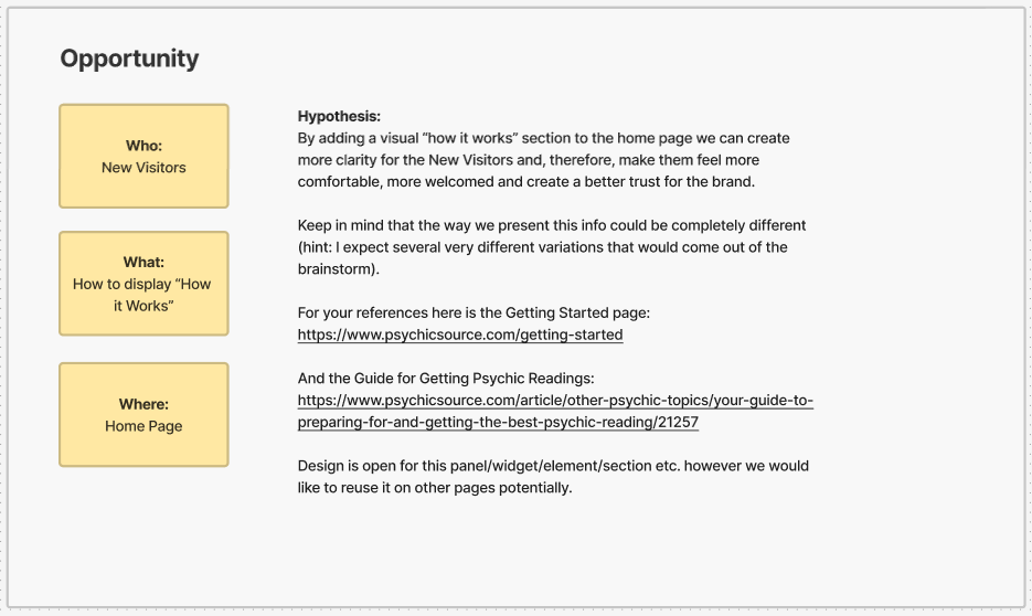
Hypothesis:Adding a visual “How It Works” section to the New Visitor Psychic Source home page will create trust for the brand and convert more users. Clear, actionable steps to get a psychic reading makes the user feel more comfortable and welcomed.
My Role: Web Optimization Team Researcher & UI/UX Designer, UI/UX Lead on Cross Functional Development Team
Teams: Web Optimization Team, Product strategy, Cross Functional Development Team consisting of: UI/UX designer, Front-end developer, Product manager and Quality assurance specialist
Timeframe: 2 Sprints total: 1 Sprint for design and 1 Sprint to execute the test
Description: A collaboration of the Optimization Team and Product Strategy held a brainstorm session to reveal key steps for the How It Works test. Data and analytics of new visitor journeys provided the foundation of basis for the test. The test ran with 4 variations plus the original for all new visitors on all devices.
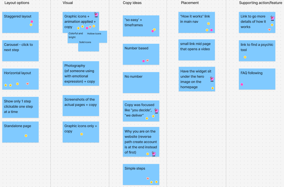
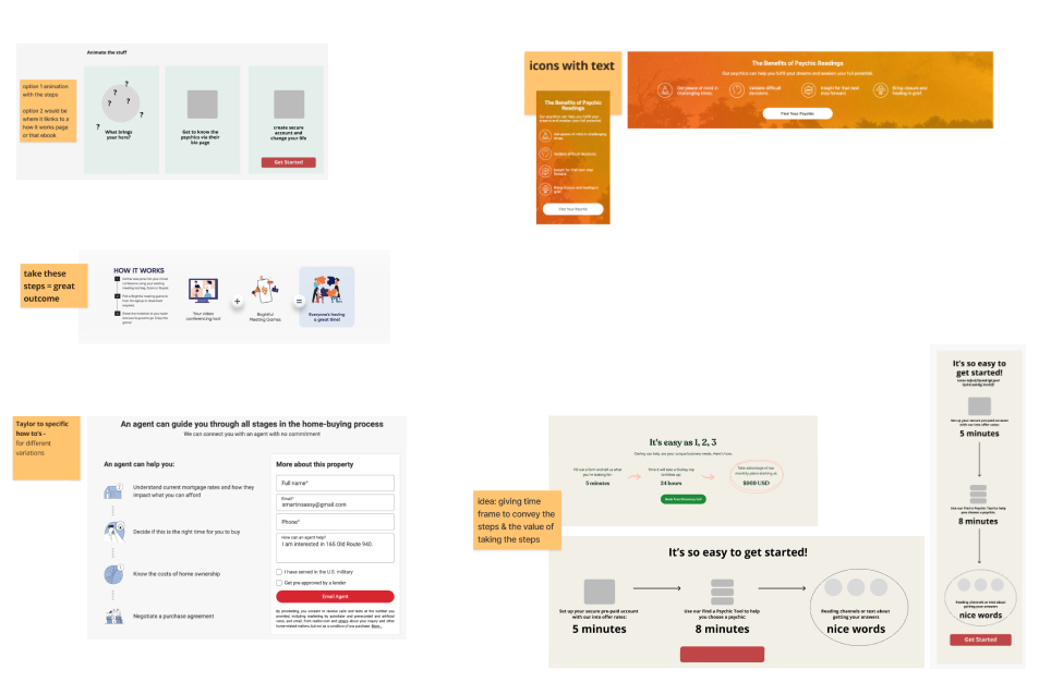
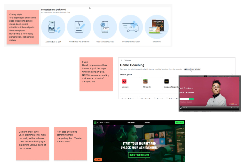
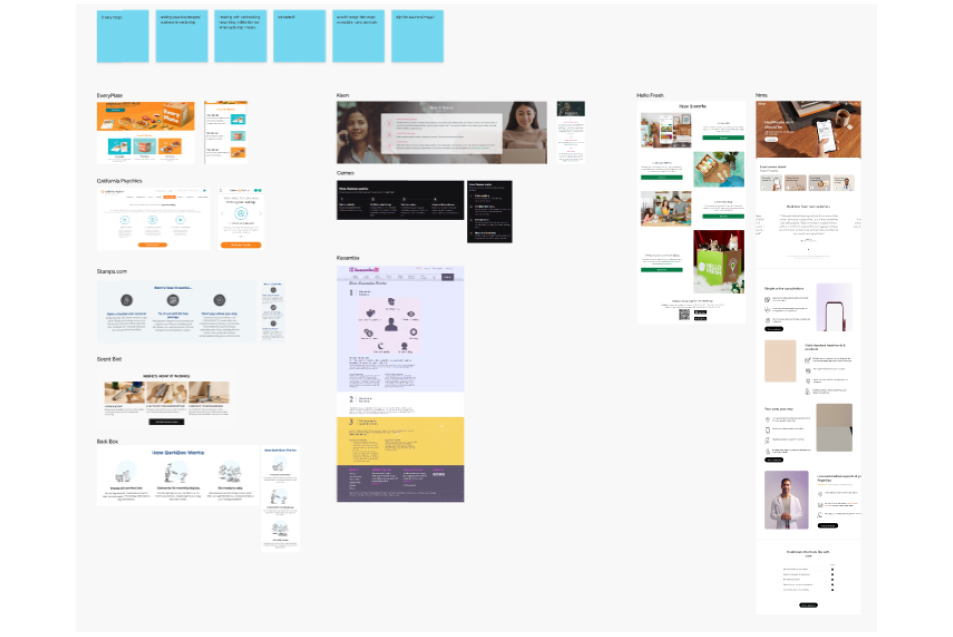
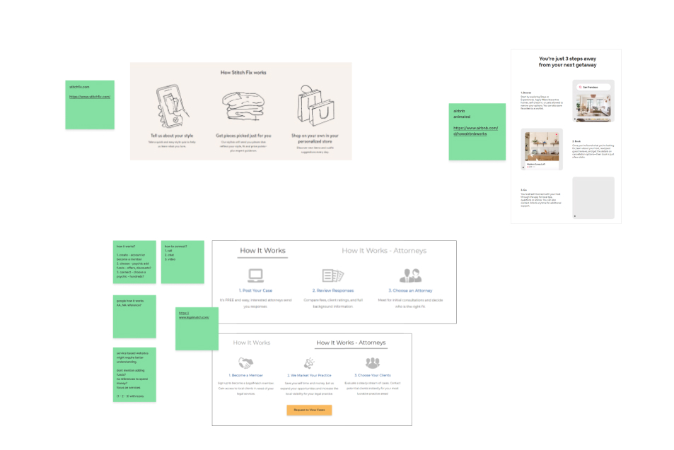
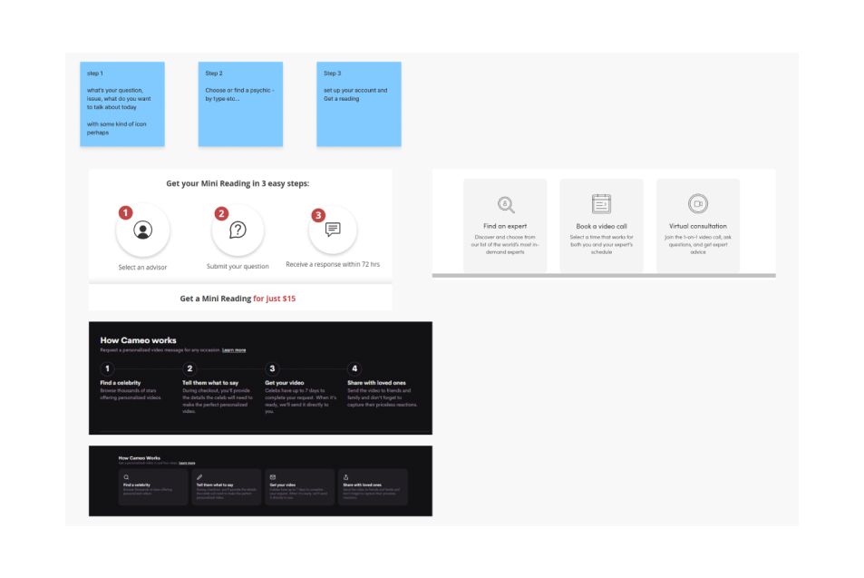
60 Minute Brainstorm
Agenda:
Intro (5min) Announce the opportunity
Participants add ideas to workspaces (5 min) Screenshot or write idea into your workspace
Discussion (5 min each) 7 x 5 = 35 min Each person discusses their design/idea
Group/discuss (10min) Help Facilitator group ideas together onto idea grid board
Vote (5 min) Participants drop 5 sticky dots per person onto favorite ideas (1 vote per idea per person)
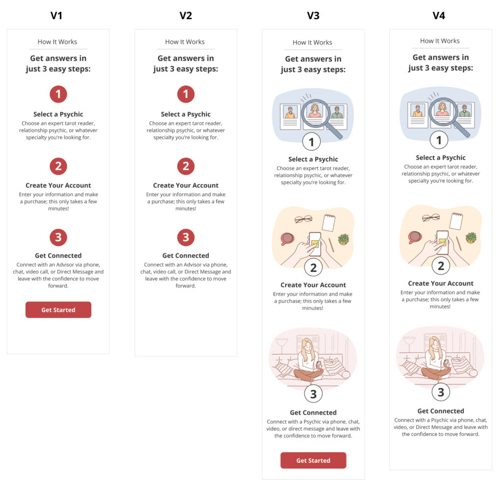
Test Variation Details
How It Works requirements:
Original – new visitor home page no changes
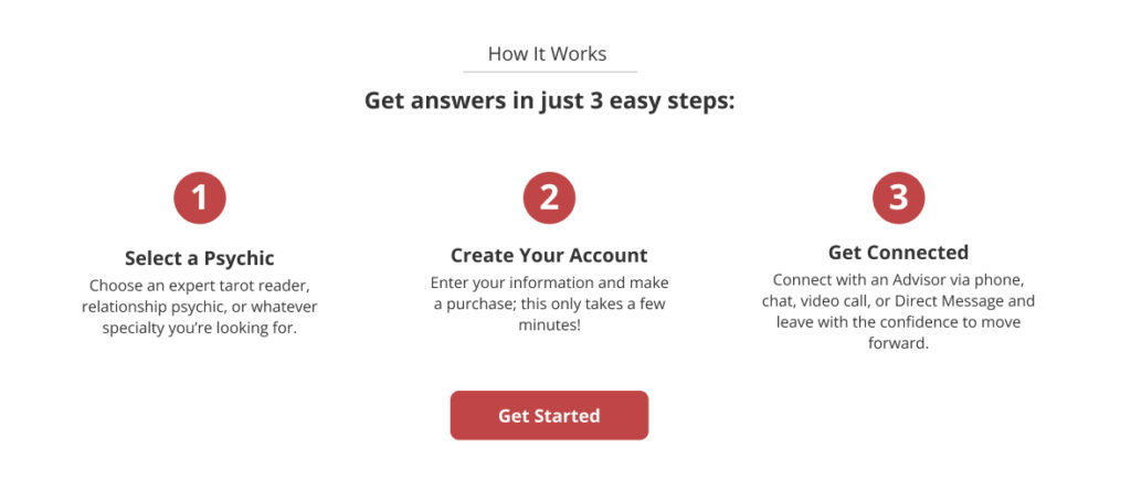
Variation 1 – numbered steps with text + CTA button that goes to /our-psychics page
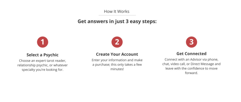
Variation 2 – numbered steps with text + NO CTA button
Variation 3 – graphical images with numbered steps, text + CTA button that goes to /our-psychics page
Variation 4 – graphical images with numbered steps, text + NO CTA button
Verify with SEO Lead ok to remove How It Works video & copy for variations
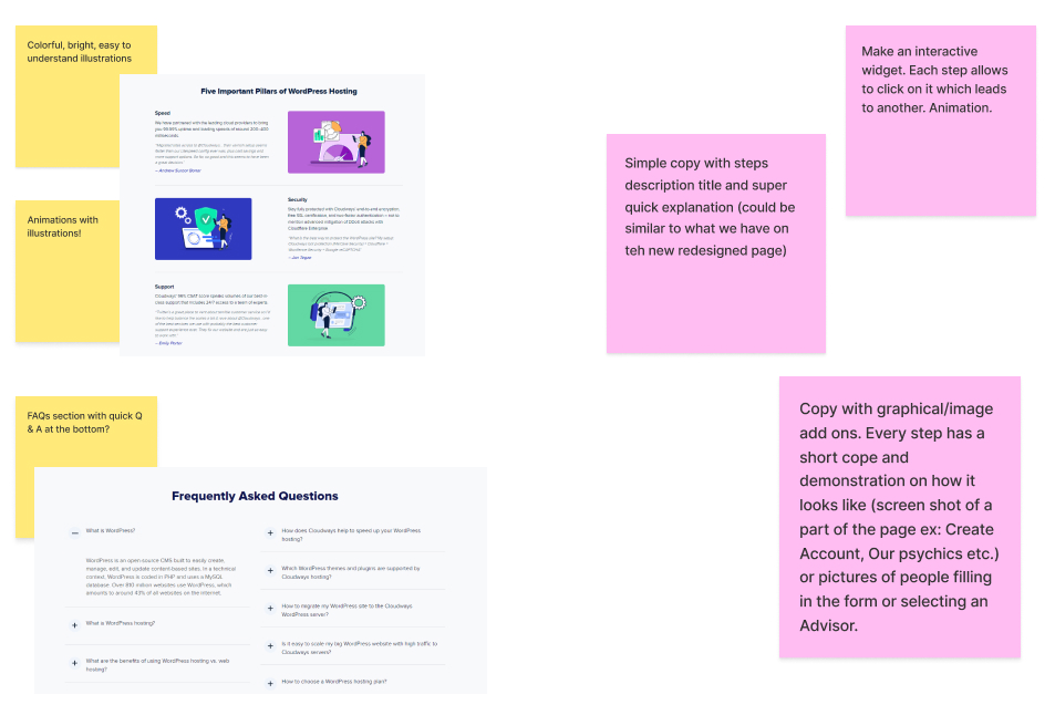
Copywriter to provide copy
Responsive design; smallest screen 320px
Technical requirements:
Front end developer to set up test in Optimizely/VS Code
Optimization Lead add metrics
Audience – new visitors, all devices
Include all events for variations, ie; tracking button clicks
GA Integration – OptimizelyXX
Variation Mock Ups
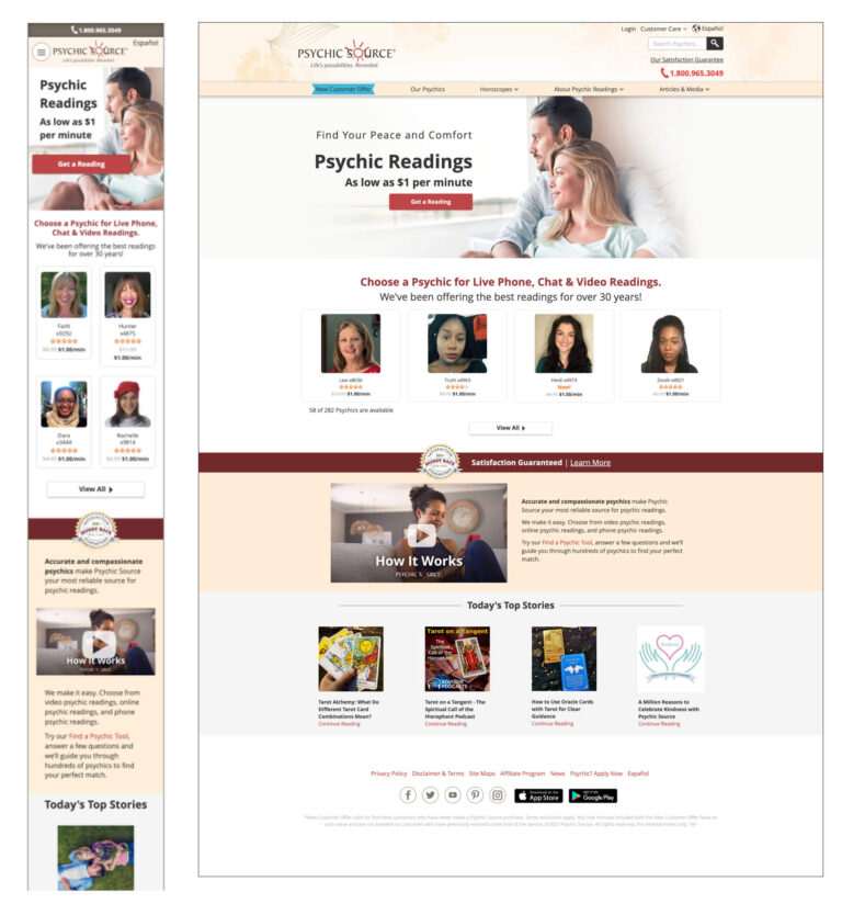
Original – Existing New Visitor Home Page – Mobile and Desktop Views
Variations 1 – 4: Mobile Views
Variations 1 – 4: Desktop Views
Experiment Results & Learning
CTA Button Loses
Variations with a CTA button had a negative effect on New Visitor flow.
Illustrations
Illustrated variations showed positive effect on New Visitor flow.
V4 is the Winner
New Member completions increased 7% over the Original.
Adding a “How It Works” section to the New Visitor Home Page Revealed Interesting Results
Conclusion:
V1 and V3 with CTA button below the steps, took users to Our Psychics page to first look at the Advisors and as second step to sign up. The test showed directing users to this flow had a negative effect on New Visitor completions.
V2 and V4 without CTA below the steps, increased New Customer completions. V4 was the overall winner, increasing conversions by 7% over the Original.
“How It Works” section in all variations reduced clicks on the Advisor Panel section by 26 – 40%.
Learning:“How It Works” section should direct users to create an account first. Having images as part of the design has a positive effect on New Customer completions as well. White the first step of the flow could be clickable, don’t include CTA button as it distracts from the Hero image CTA.
Recommendation with Adjustments:
Implement V4: Illustration without CTA
Make Step 1 “Create Your Account” and Step 2 “Select a Psychic”
Step 1 section: “Create Your Account” text links to enroll flow
Step 2 section: “Select a Psychic” links to our psychics page
My Notes: Being part of the Web Optimization team was fulfilling in many ways:
Exploring new concepts with a comparatively low level of risk
Working with colleagues across the organization
Capability to enhance strategies for acquiring and retaining customers
Listening to colleagues’ perspectives and opening my perception